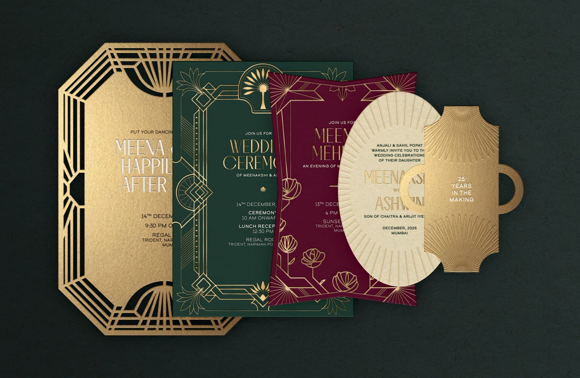
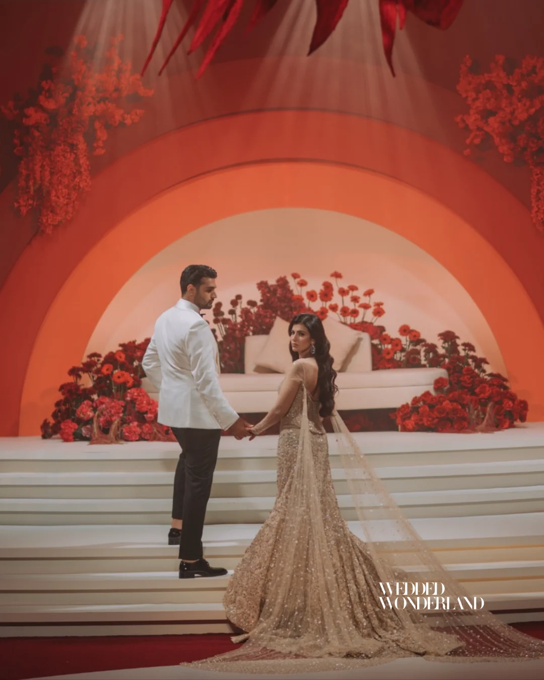
If you’re getting married in 2026, this is the shift to understand: colour is no longer just there to “match.” It is there to build a feeling. 2026 is leaning into fine-art tones, interior-design-led shades, browns, richer pinks and bolder palettes. We are seeing a shift towards black cherry, aubergine, butter yellow, terracotta, lemon yellow, teal, cobalt, deep plum, espresso, olive, orchid and modern pastel mixes.
Couples are already translating these colors into weddings through soft metallics, icy tones, celestial shimmer, moody plum, and structured neutrals.
The room-changer. Use it when you want one colour to wake up an otherwise neutral setting.

Cleaner and icier than cobalt, this is the shade for modern brides who want glass, chrome, and light to do the talking.
Louder than burgundy, sharper than scarlet, and perfect for couples who want fashion energy in the room.

Dark, glossy, and a little dangerous. This is romance with a sharper edge.
The cinematic red-wine tone that instantly makes florals, velvet, and candlelight feel more expensive.
These statement shades are backed by Pinterest’s official 2026 colour lineup and wedding editor picks calling out cool blues, juicy reds, black cherry, burgundy, and cobalt-based pairings.
One of Pinterest’s official 2026 colours, and probably the fastest way to make a wedding feel editorial.

Deep purple with grown-up drama. Beautiful in florals, ribbon, bridesmaid satin, and after-dark tablescapes.
Still romantic, but less predictable than pale pink. This is the softer side of the purple story.
Brighter, glossier, and more fashion-led than lavender. Great for couples who want femininity without softness overload.
Less “garden wedding,” more “curated luxury world.”
One of the biggest signals for 2026. Warm, grounding, and far more interesting than default beige.

Soft, creamy brown for couples who want warmth without heaviness.
The anti-white neutral. Elegant, understated, and very interior-design coded.
A warmer, more lived-in version of white that feels romantic instead of stark.
Gold’s cooler, sharper successor. Think chrome accents, rim-lit glassware, brushed metal, mirrored details.

Soft sunshine. The easiest way to make a wedding feel fresh, light, and modern without going full colour explosion.
More daring than butter. Use it as a high-impact accent, not an all-over wash.
Pinterest’s rebellious green-yellow and one of the boldest trend signals of the year.
Pinterest’s warm red-orange. Joyful, fashion-forward, and ideal for destination energy.
Still here, but more polished now. Less boho, more sculptural, sun-drenched luxury.
The biggest mistake couples will make in 2026 is choosing a “pretty” palette instead of a point of view.
The weddings that will feel the most current are not the ones using ten random colours. They are the ones building a world around one hero shade, one supporting tone, one grounding neutral, and one reflective finish. That is why cobalt with ivory, plum noir with silver, butter yellow with mushroom, or black cherry with vintage ivory will land harder than a palette that tries to do everything at once. That shift toward aesthetic-led, interior-inspired colour is exactly what major wedding coverage is pointing to this year.
Another smart move: Food-inspired reds, citrus brights, herbs, and even fruits being worked into colour stories, which is why the best palettes now feel layered, textured, and immersive instead of flat.
2026 is not the year of playing it safe.
It is the year of emotionally intelligent colour. Colour that feels cinematic. Colour that feels editorial. Colour that turns a wedding from “nice” into “I have never seen anything like this before.”
So yes, you can still do neutrals. But in 2026, the neutrals are warmer, deeper, stranger, and far more intentional. And if you’re brave enough to bring in cobalt, plum noir, persimmon, butter yellow, silver, or black cherry, your wedding will not just look on-trend.
It will look like it belongs in the future.
Search real weddings, venues and vendors from around the world.
Search Wedded Wonderland