

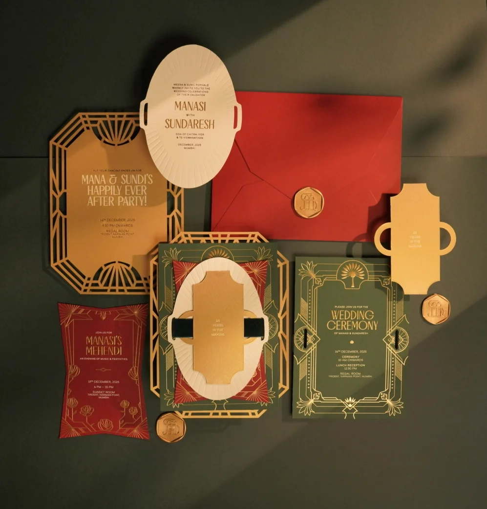
If 2025 was about “matching the flowers,” 2026 is about something far more interesting: stationery as storytelling.
We sat down with Sanjana, founder of The Bombay Lettering Company (and an official Wedded Wonderland partner) to decode what couples are really asking for, beyond the Pinterest boards, beyond the safe neutrals, and straight into the palettes that feel personal, elevated, and intentional.
Because the truth is: Your stationery isn’t just paper. It’s the first emotional clue your guests get about your wedding.
Sanjana’s biggest observation isn’t a shade. It’s a shift.
In 2026, couples are increasingly picking colors that reflect:
What’s emerging isn’t “one hot palette.” It’s a new confidence:
couples aren’t tied to tradition, they’re tied to meaning.
And that’s what makes 2026 stationery feel fresh: it’s not trying to be perfect, it’s trying to be personal.
Jewel tones aren’t shy. They don’t need help. But when done right, they look expensive, and when done wrong, they look…heavy.
Sanjana’s approach: let jewel tones lead, then choose one supporting detail that lifts the palette without competing with it.
Her go-to pairings for 2026:
She recently designed an art-deco suite where jewel tones were layered instead of overly decorated, so the color was the hero.
2026 rule: If your palette is bold, your execution should be calm.
We need to talk about pistachio green.
It’s not mint. It’s not sage. It’s not “bridesmaid dress green.”
It’s softer, cleaner, modern, and it photographs beautifully.
Sanjana shared that pistachio has been popping up again and again in requests this year, and she gets why:
it works across Indian and global aesthetics, and it feels fresh without being loud.
Pairs beautifully with:
If you want a modern pastel that still feels elevated: pistachio is your girl.
“More colors” ≠ more premium
Sanjana sees two mistakes on repeat:
Mistake #1: Trying to include too many colors
A refined palette is a focused palette.
The moment you try to squeeze in five different “meaningful” shades, the suite loses its clarity.
Mistake #2: Forcing a trend that doesn’t fit your personality
This one is big:
Guests can feel when something is personal… and they can also feel when something is performative.
Her advice is blunt (and needed): Don’t make your day about Pinterest. Make it yours.
Stationery is no longer just a detail. It’s the tone-setter. The mood-board in real life. The first “this is us” your guests hold in their hands.
And if there’s one takeaway from Sanjana’s forecast, it’s this:
2026 couples aren’t chasing trends. They’re choosing meaning, and making it look incredible.

From Venus retrograde wedding dates to birth char...
LEARN MORE
From a Parisian bridal...
LEARN MORE
Disney’s Fairy Tale Weddings marks its 35th anniv...
LEARN MORE
Elevate Your Brand With